- You are here:
-
Home

-
Best Practices & Strategies
- Optimizing Newsletters for Mobile Devices
- Category: November 2012 - Email & SMS Marketing
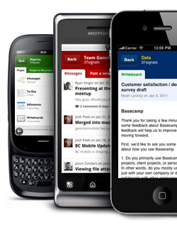 Smartphone and tablet sales depict the importance of being flexible and connected in modern life. Numerous studies have shown that more and more people are mailing, chatting and surfing without desktop computers and are going online with smartphones and tablets even at home rather than with desktop or notebook. Nowadays, it is normal for e-mails to be delivered via smartphone.
Different resolutions challenge email marketing
The variety of mobile devices on the market is immense, thus, the resulting variety of screen sizes and resolutions provides email marketers with a great challenge. A consistently accurate depiction of content is difficult since there are so many screen sizes. If your design requires a lot of scrolling and zooming, it is most likely to frustrate your audience more than anything else. If the links are too small to be easily clicked on a small touch screen, your newsletter may not be worth the effort any longer. Therefore, make sure that your newsletter displays perfectly and allows easy navigation on all smartphones and tablets.
Here‘s how you can optimize your newsletter:
1. Responsive design
With the help of modern web design, responsive design can master the challenges of screen resolutions - what does not fit, is made to fit. You should have a dynamic layout that adapts to the respective screen. To achieve this, it is important to consider both the technical and the design aspects.
CSS3 media queries enable determining the viewer‘s display size, and with the help of additional CSS style information for small display sizes, the newsletter layout can be adjusted accordingly. Content elements, such as text or images will be automatically scaled and arranged.
This is not new in web design, but newsletters need to catch up urgently. The effort will pay off!
Thus, be ahead of the competition and make your newsletters more eye pleasing and easier to navigate for your audience.Â
2. Newsletter optimization
Alternative versions of your newsletter need some editorial work in most cases, too:
- focus on the most important content first;
- highlight important sections;
- use CSS to define which texts can be hidden when;
- make sure that texts scale correctly and are well readable on smartphones;
- be generous on the font size;
- divide longer text with subheadings;
- keep items such as tables and images scalable, use media query for flexible table dimensions;
- if possible, use single-column layouts, making better use of the available space;
- keep the amount of data as small as possible to reduce loading times;
- design clickable elements for touchscreens, with larger buttons and more space around links;
- make good use of the pre-header: smartphones not only display the subject line, but also the first characters of the e-mail, so make sure to use this to draw attention to your content and create additional incentives to open the newsletter.
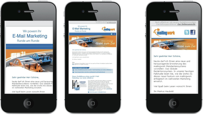
In the following image, mailingwork shows examples of a newsletter before optimization, that still needs zooming in and out and scrolling - and on the right the optimized version with its single column layout and adapted logo and image size. (Source: www.mailingwork.de)
By MediaBUZZ
